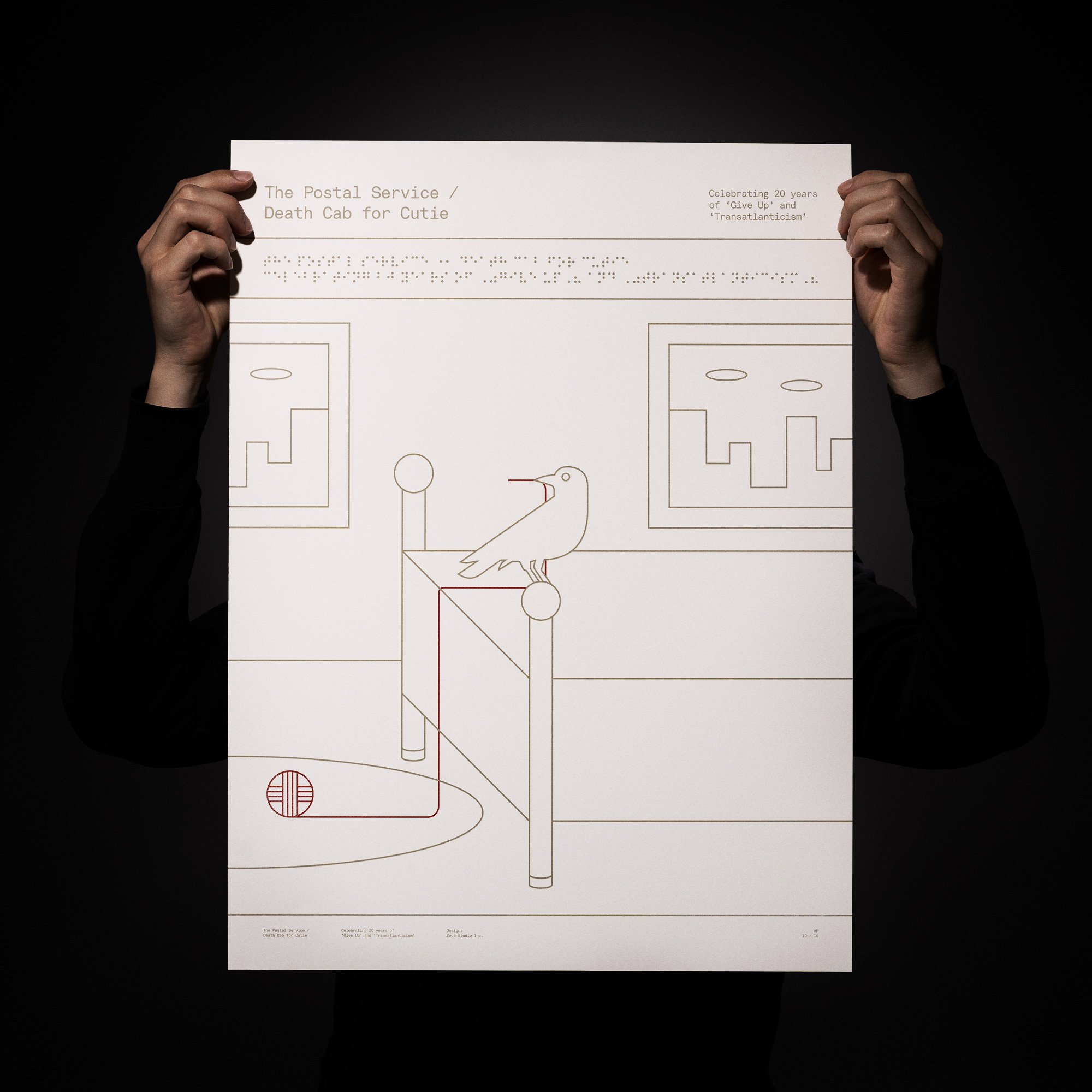
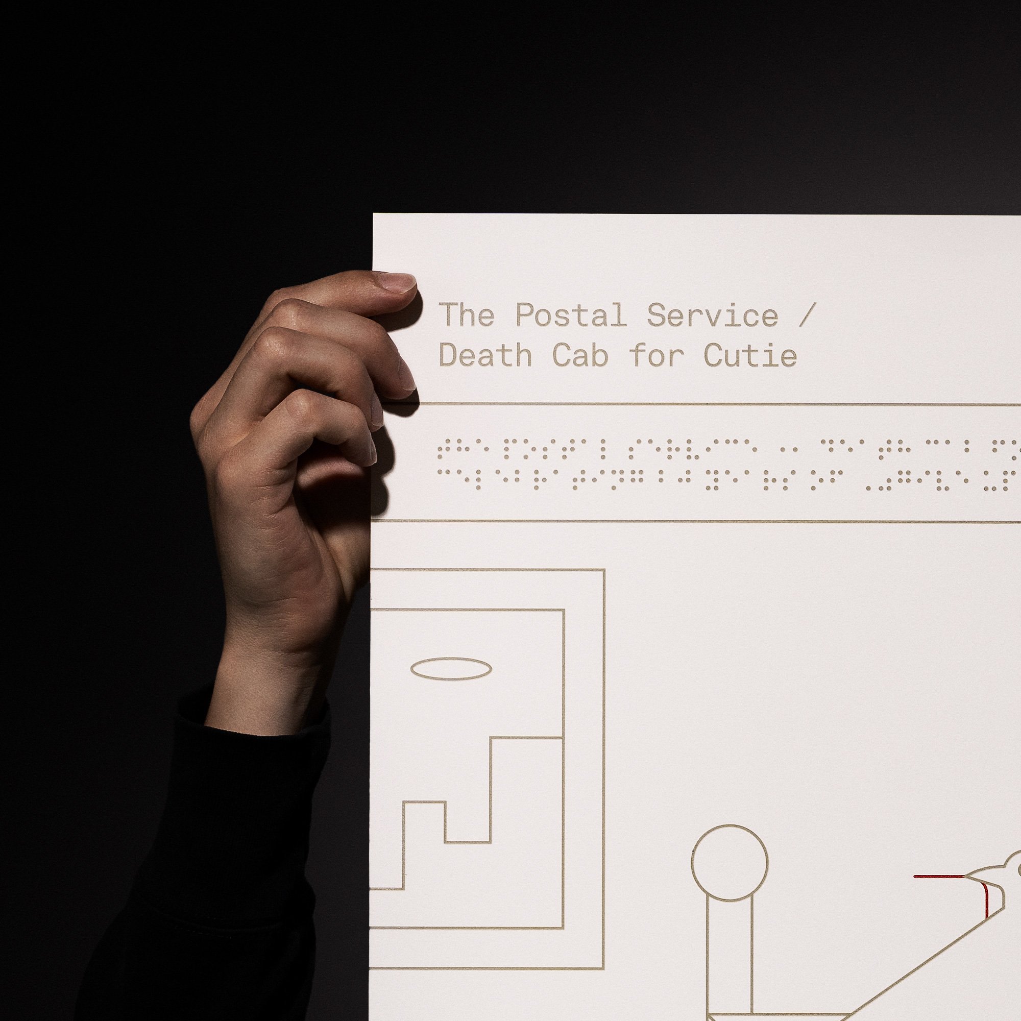
Death Cab for Cutie / The Postal Service 20th Anniversary Poster
It all begins with an idea.
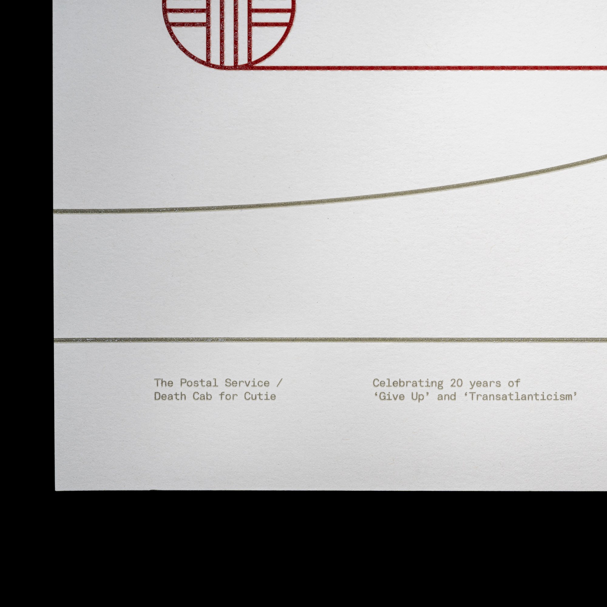
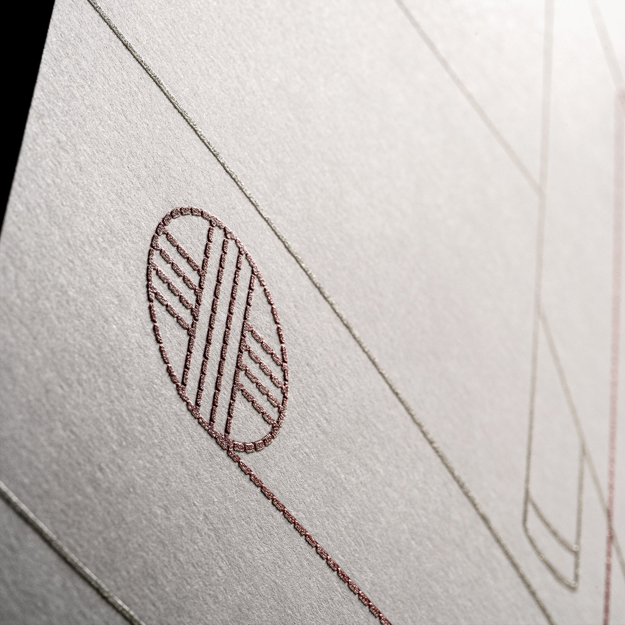
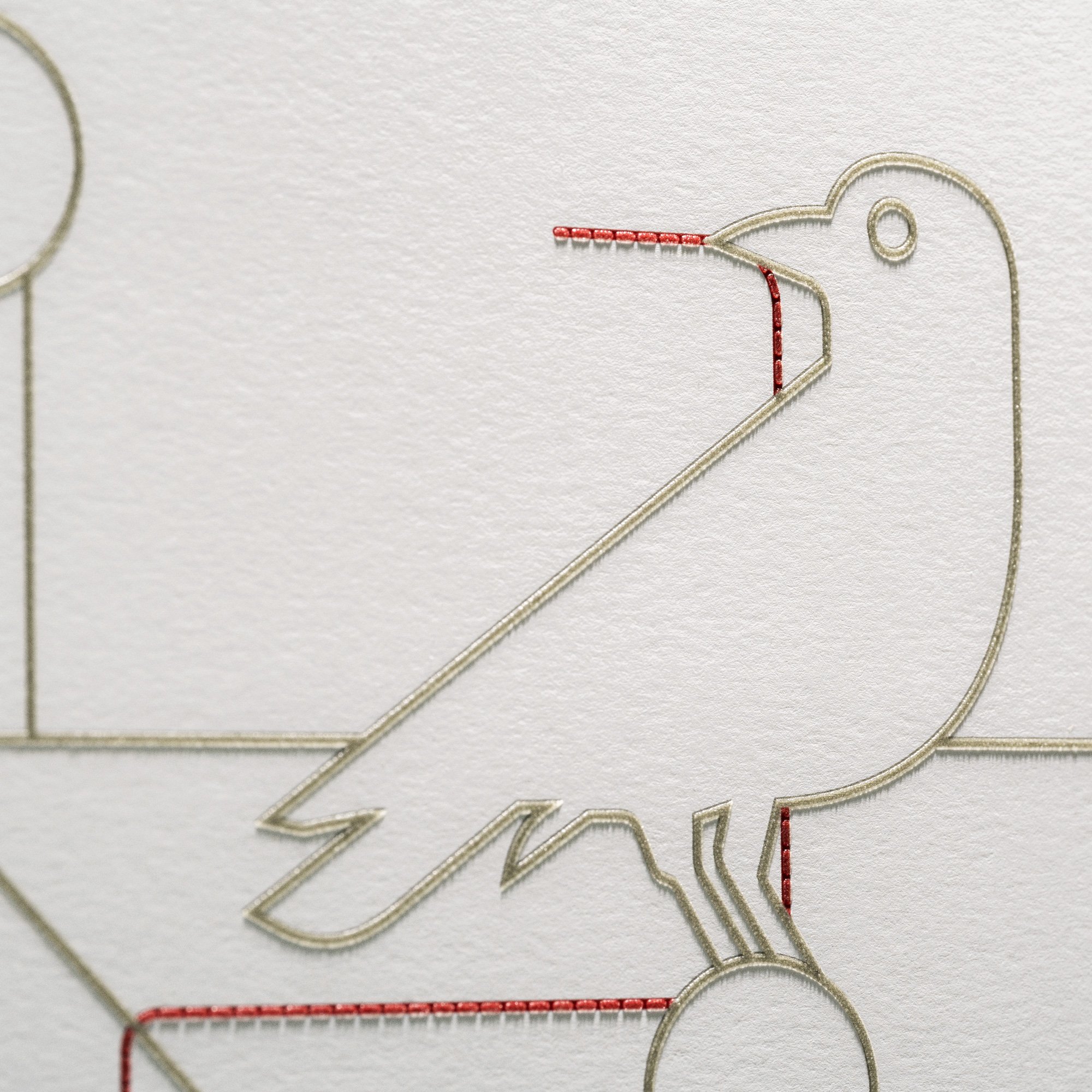
Death Cab for Cutie's management approached five artists in total to create a poster commemorating the 20th anniversary of their albums 'Transatlanticism' and 'Give Up.' Being asked to join this select group of artists was a tremendous honor. Our task as designers was to craft a distinctive poster that seamlessly fused both album covers. In my particular design, I aimed to capture the essence of both albums by featuring the crow from 'Transatlanticism' perched at the foot of the bed from 'Give Up,' with a red yarn extending from its beak. Every element within the bedroom held symbolic significance tied to The Postal Service's 'Give Up' album, while the crow with the red yarn symbolized Death Cab for Cutie's 'Transatlanticism' record.
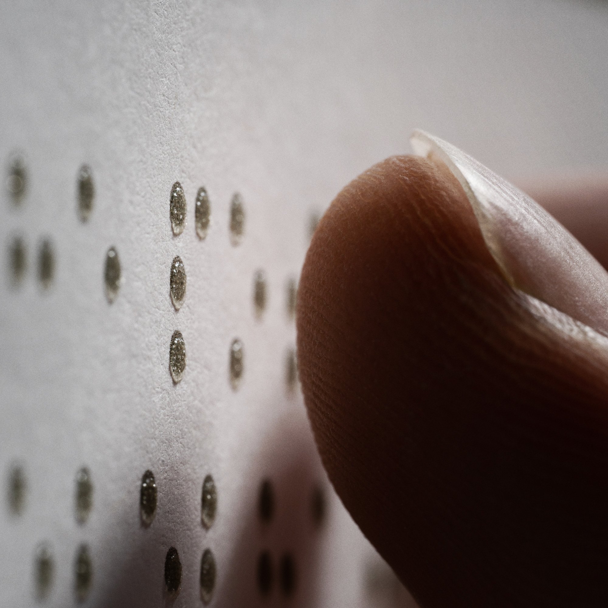
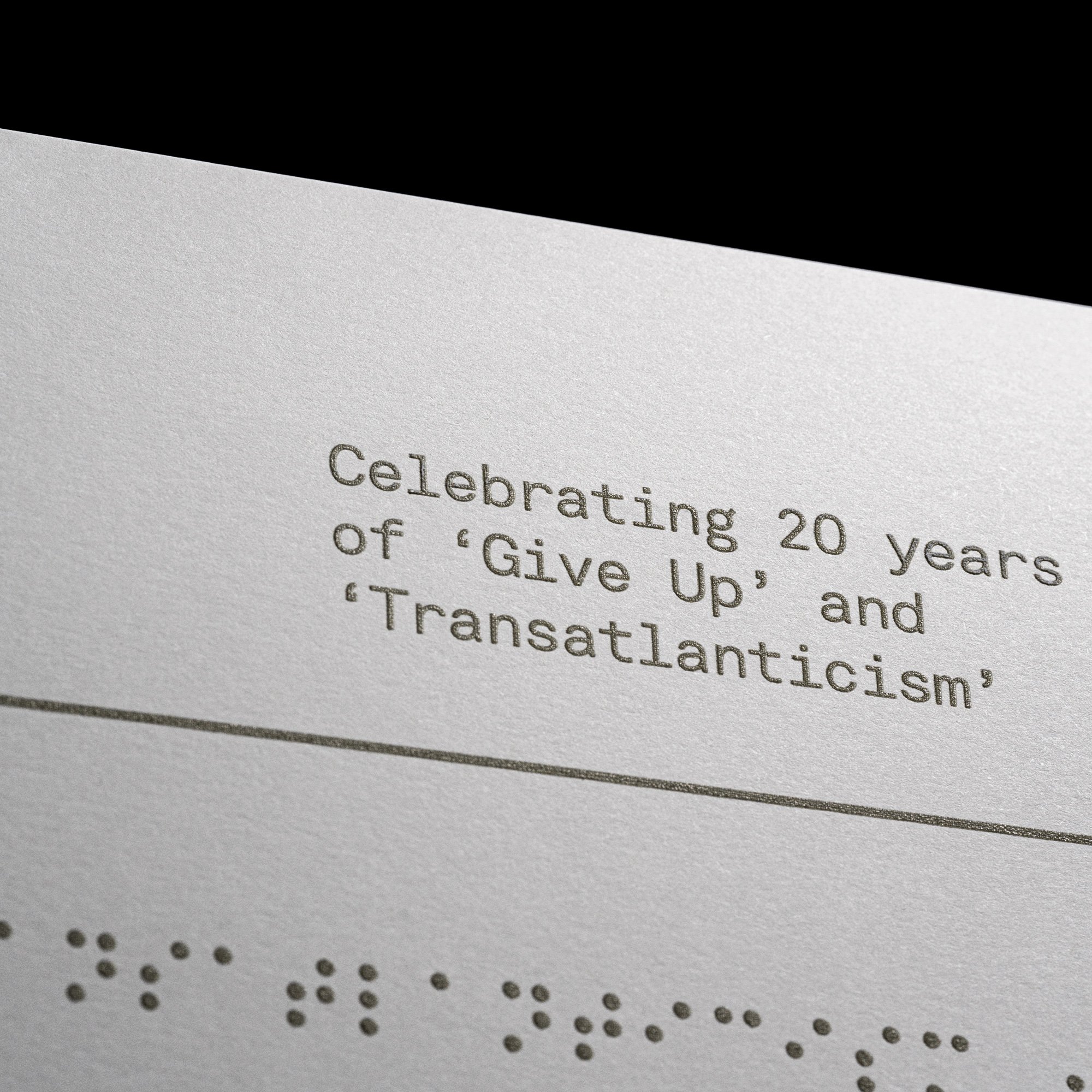
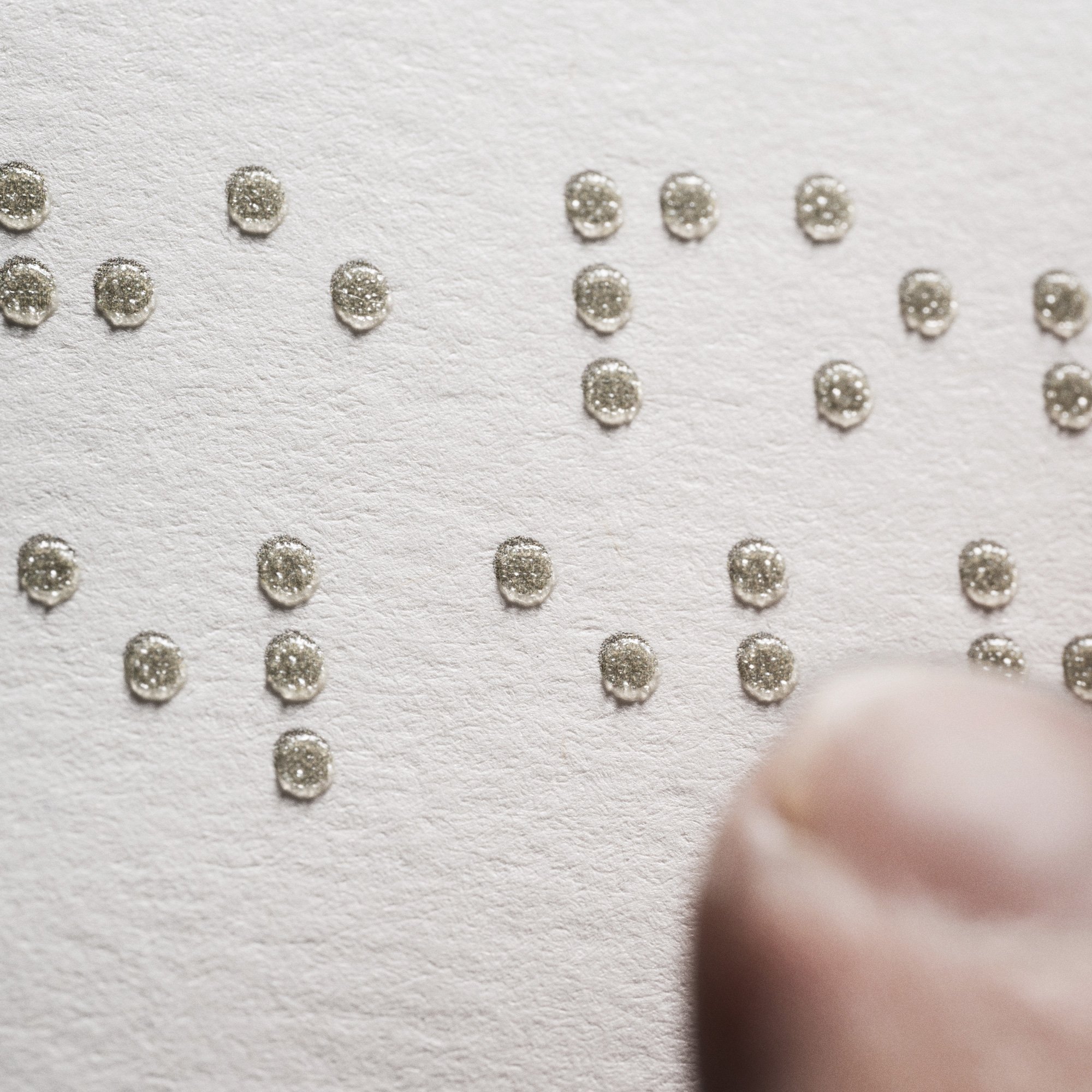
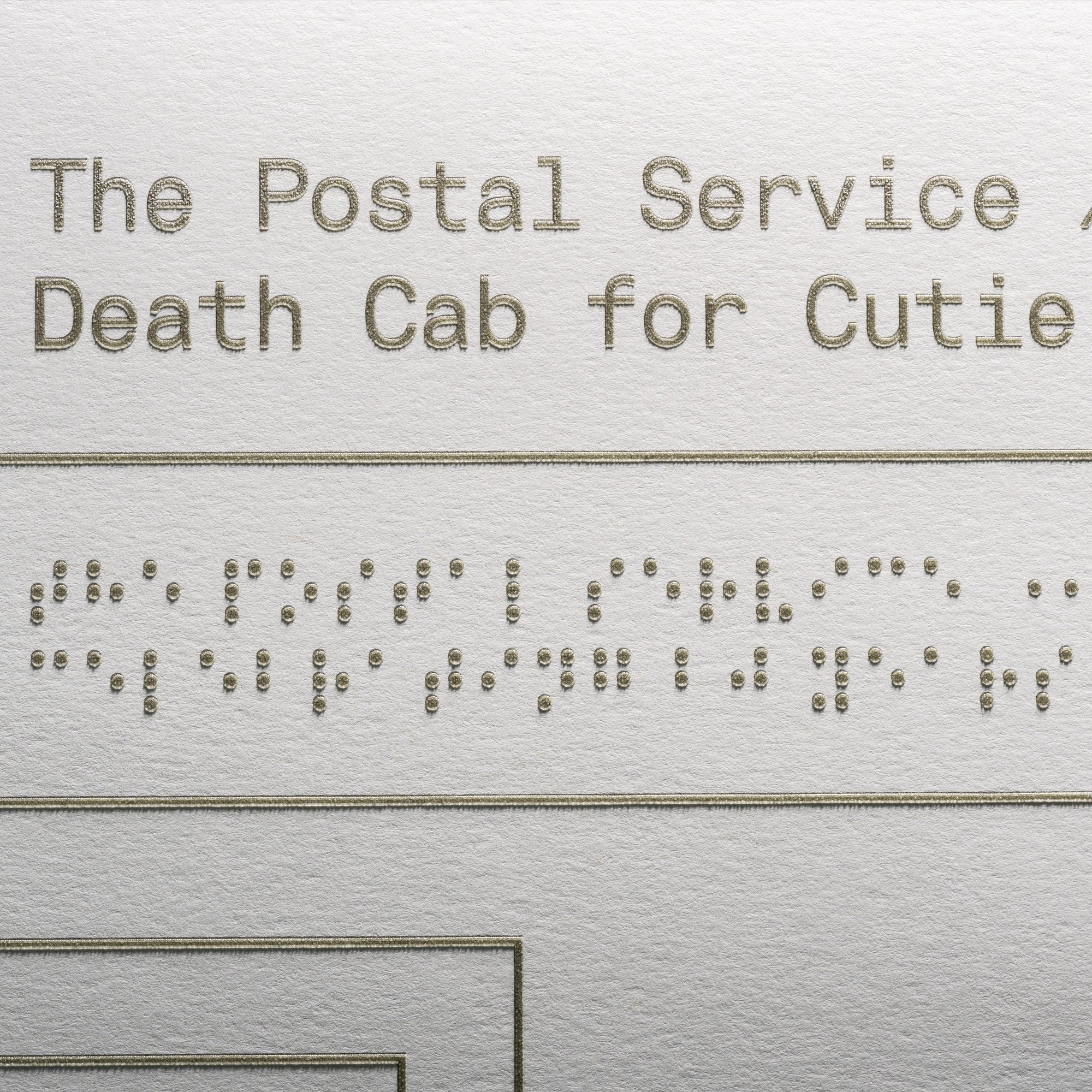
Beyond the visual symbolism of the poster, it was evident to me that the design should exude a minimalist quality. To my perception, both bands have consistently embodied modernism and a commitment to clean, contemporary design aesthetics. This is how I envision visual design for both bands above all else. An additional and unique aspect of this poster was the band's request to incorporate a braille component, ensuring that individuals with visual impairments could also experience the poster uniquely. To accomplish this, Flash Reproductions from Toronto, Canada utilized screen printing with a transparent raised ink. They meticulously applied the ink multiple times to create a distinct raised texture. Through this technique, we achieved a truly one-of-a-kind poster design that not only visually encapsulates both albums but also tells a tactile story specific to each record. The braille section of the poster translates to: "The Postal Service / Death Cab for Cutie Celebrating 20 years of 'Give Up' and 'Transatlanticism.'"
Photography by Worker Bee Supply
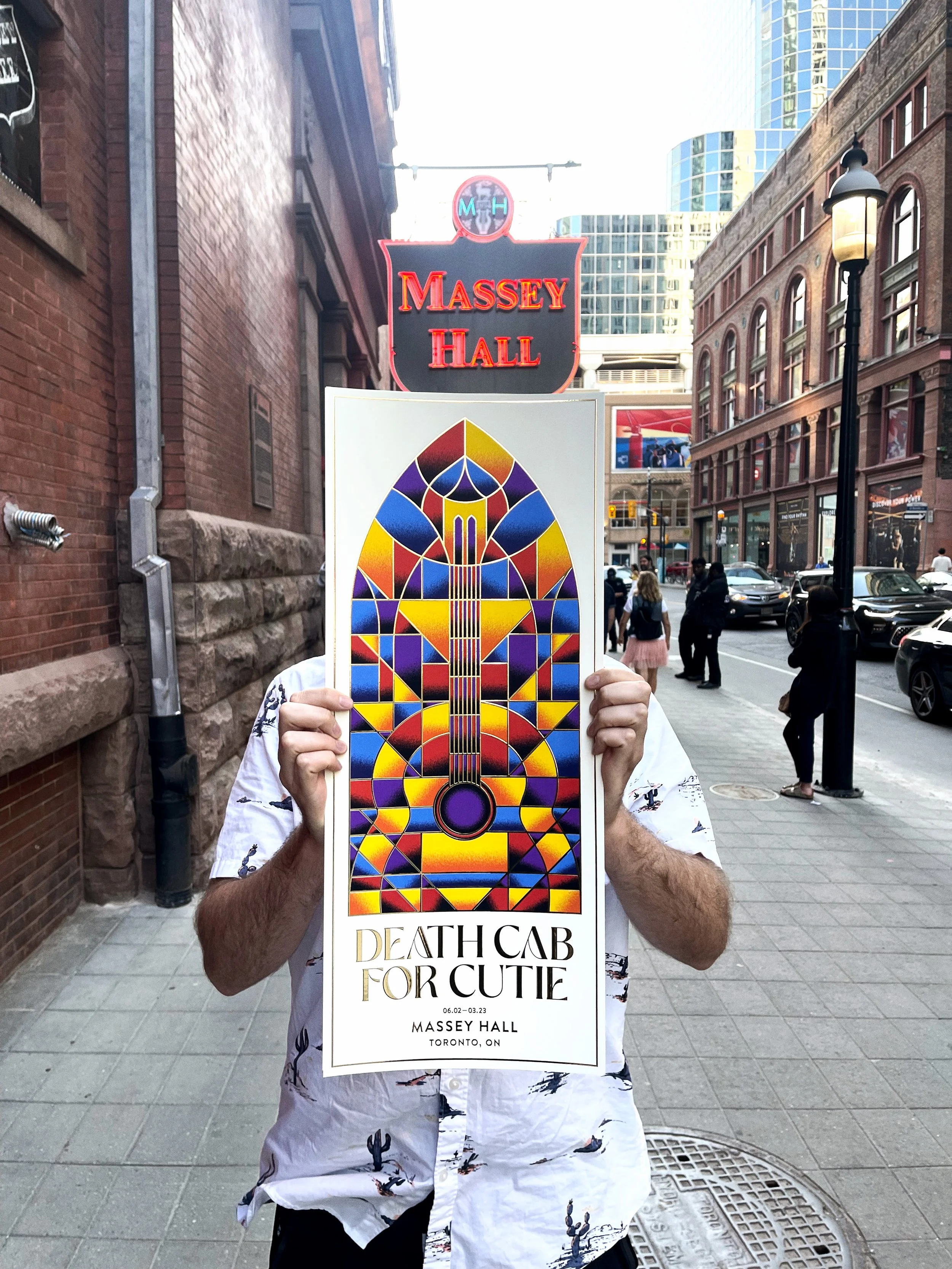
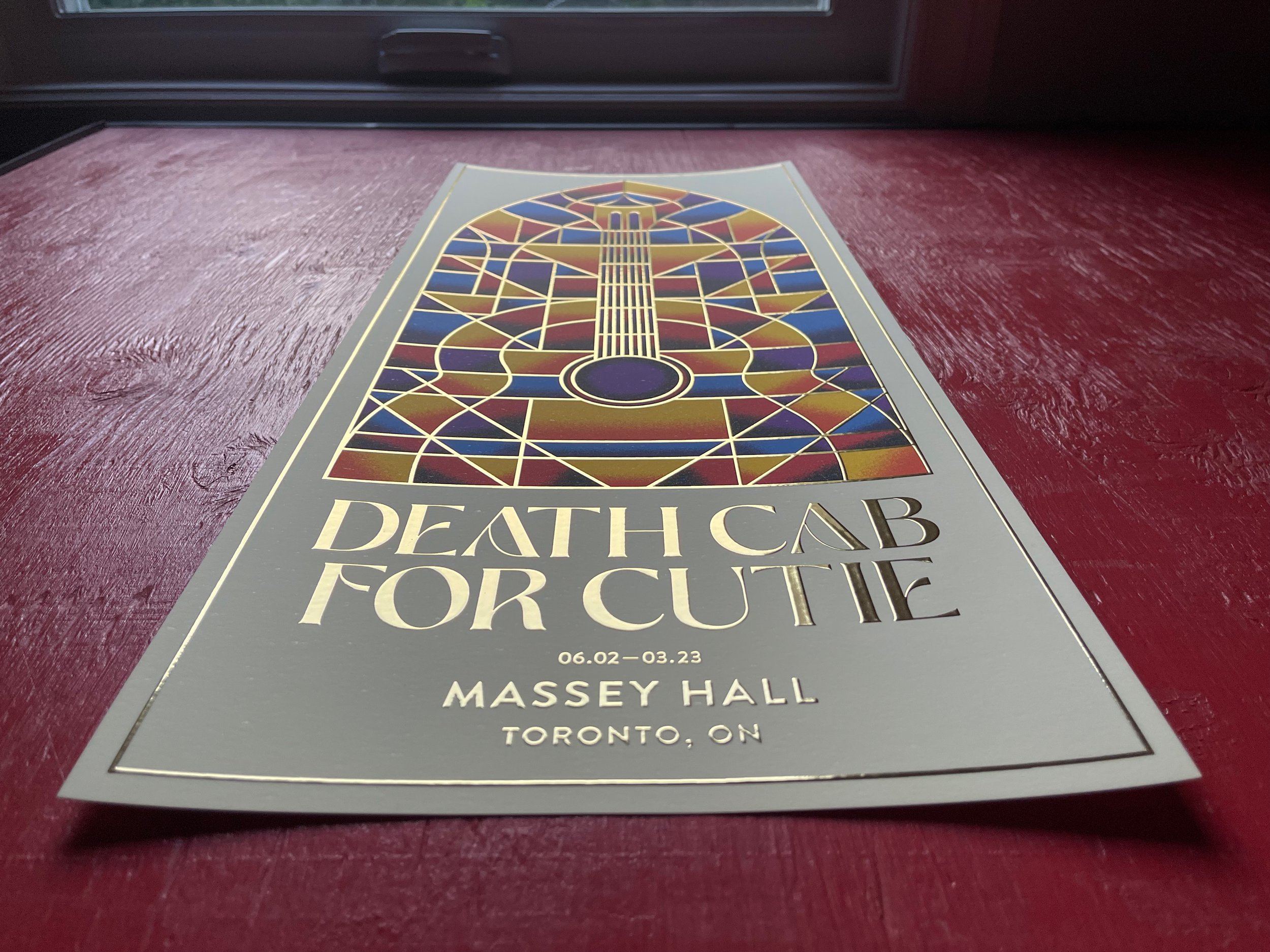
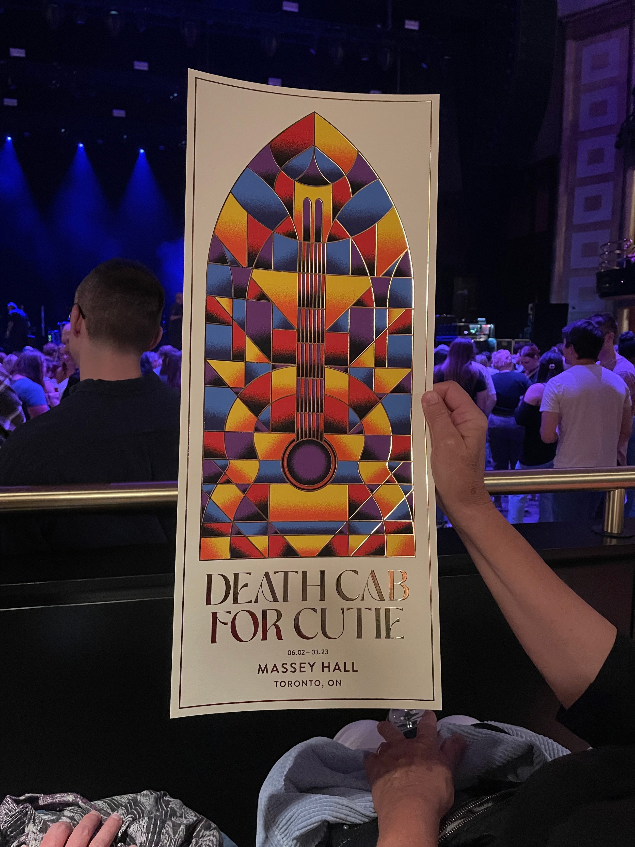
Death Cab for Cutie - Toronto Gig Poster
It all begins with an idea.
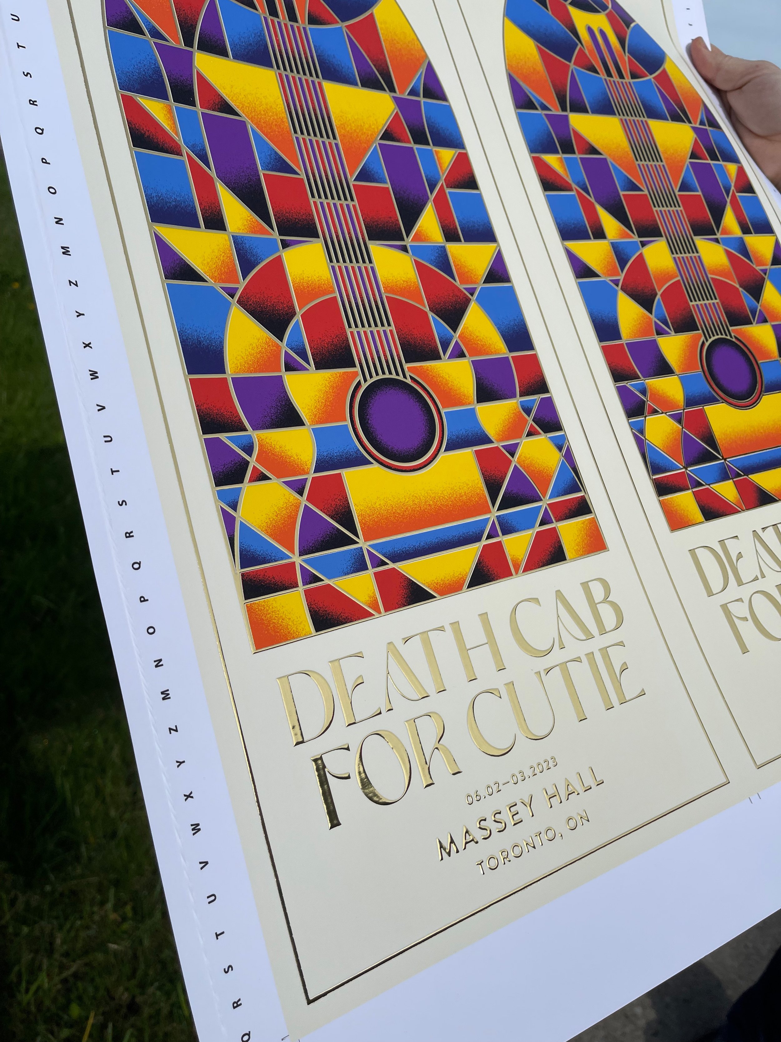
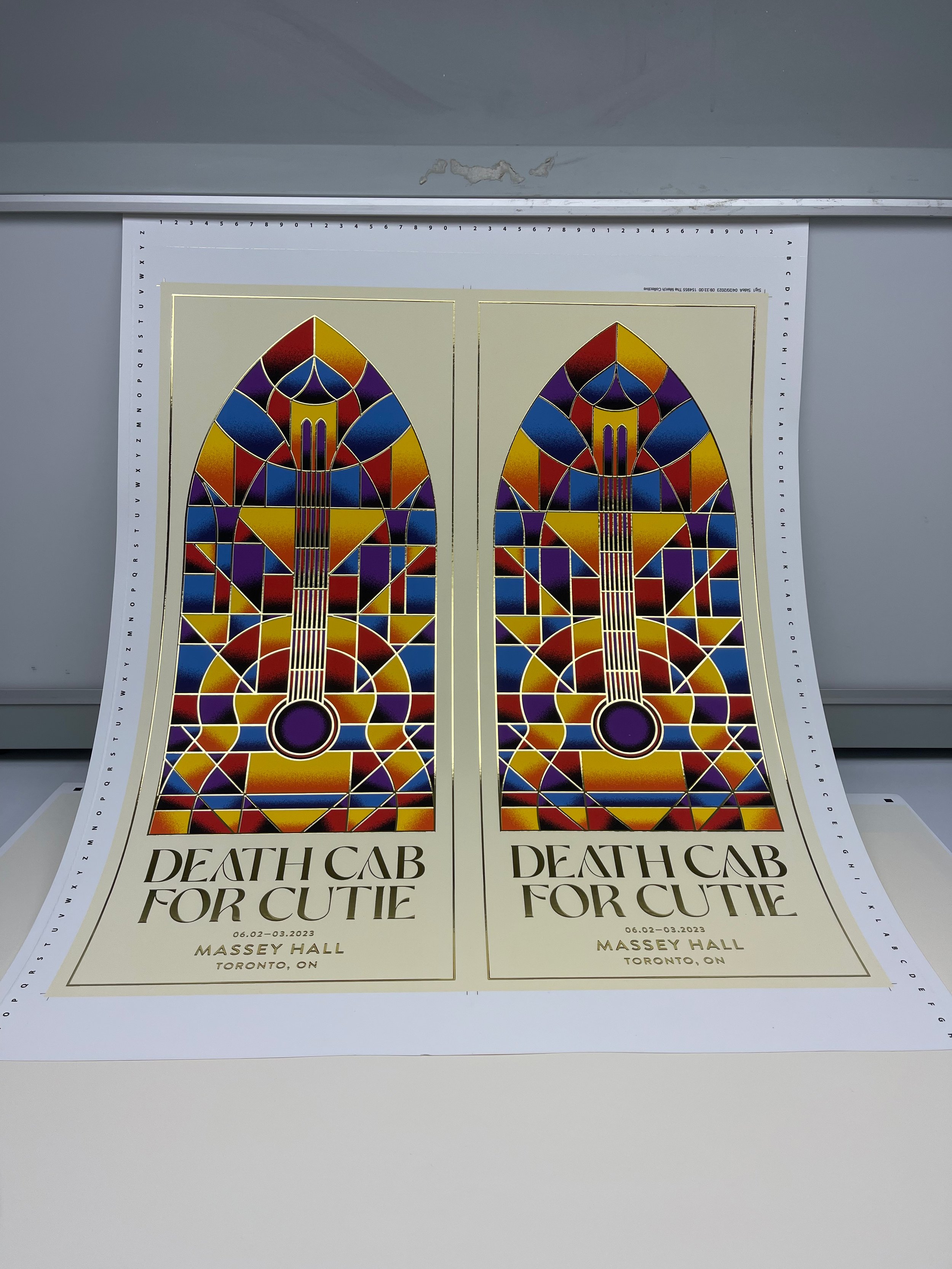
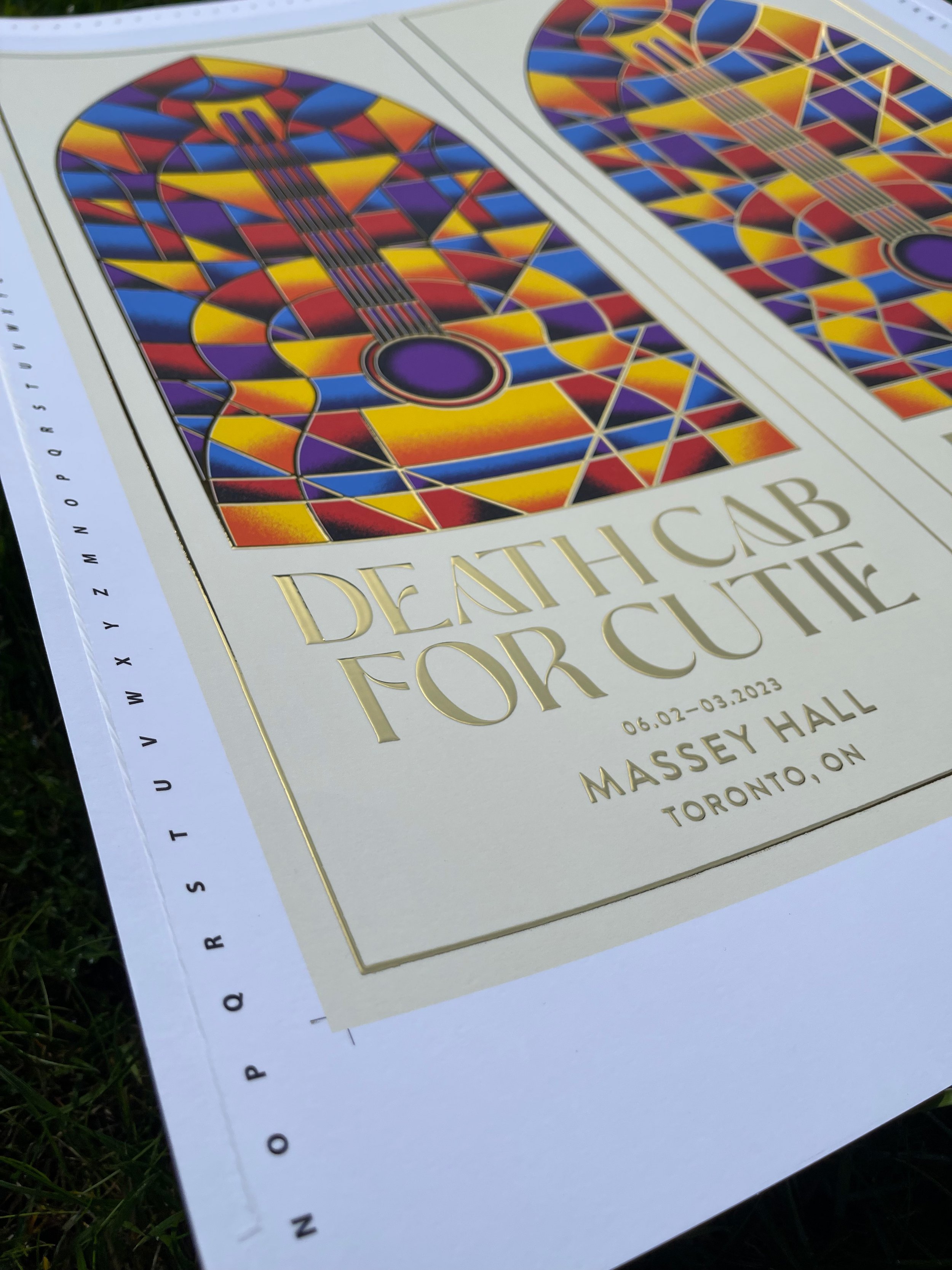
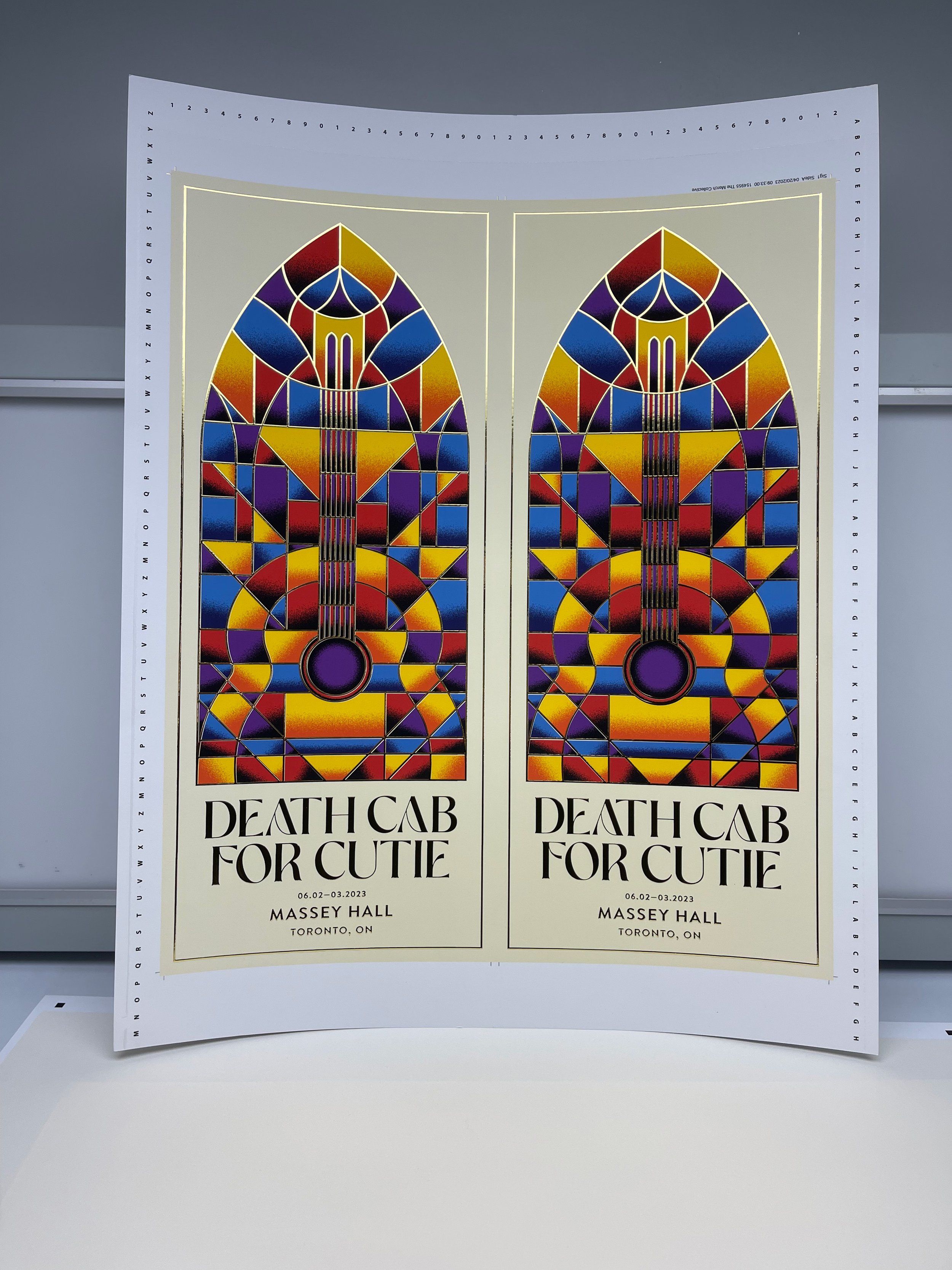
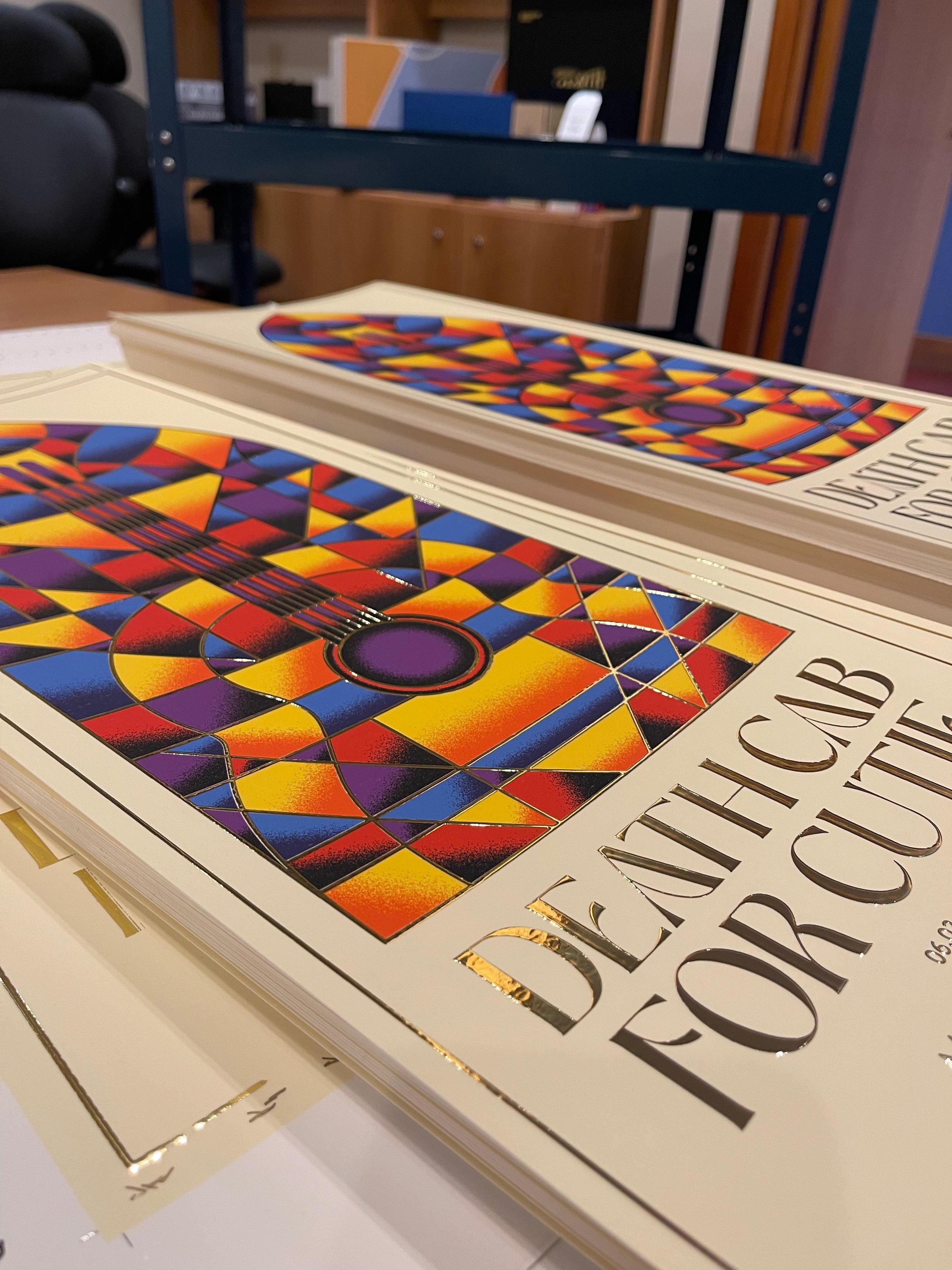
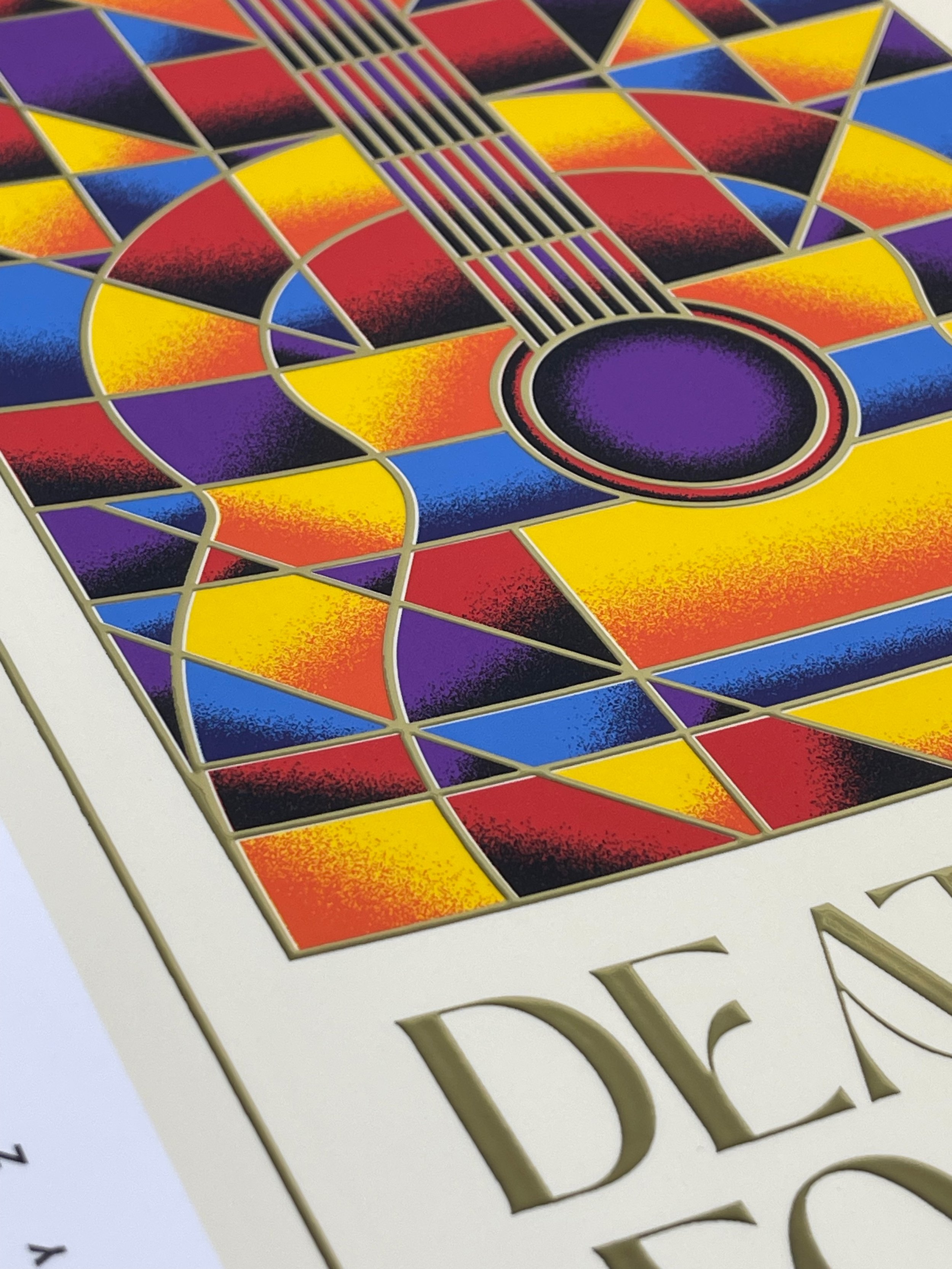
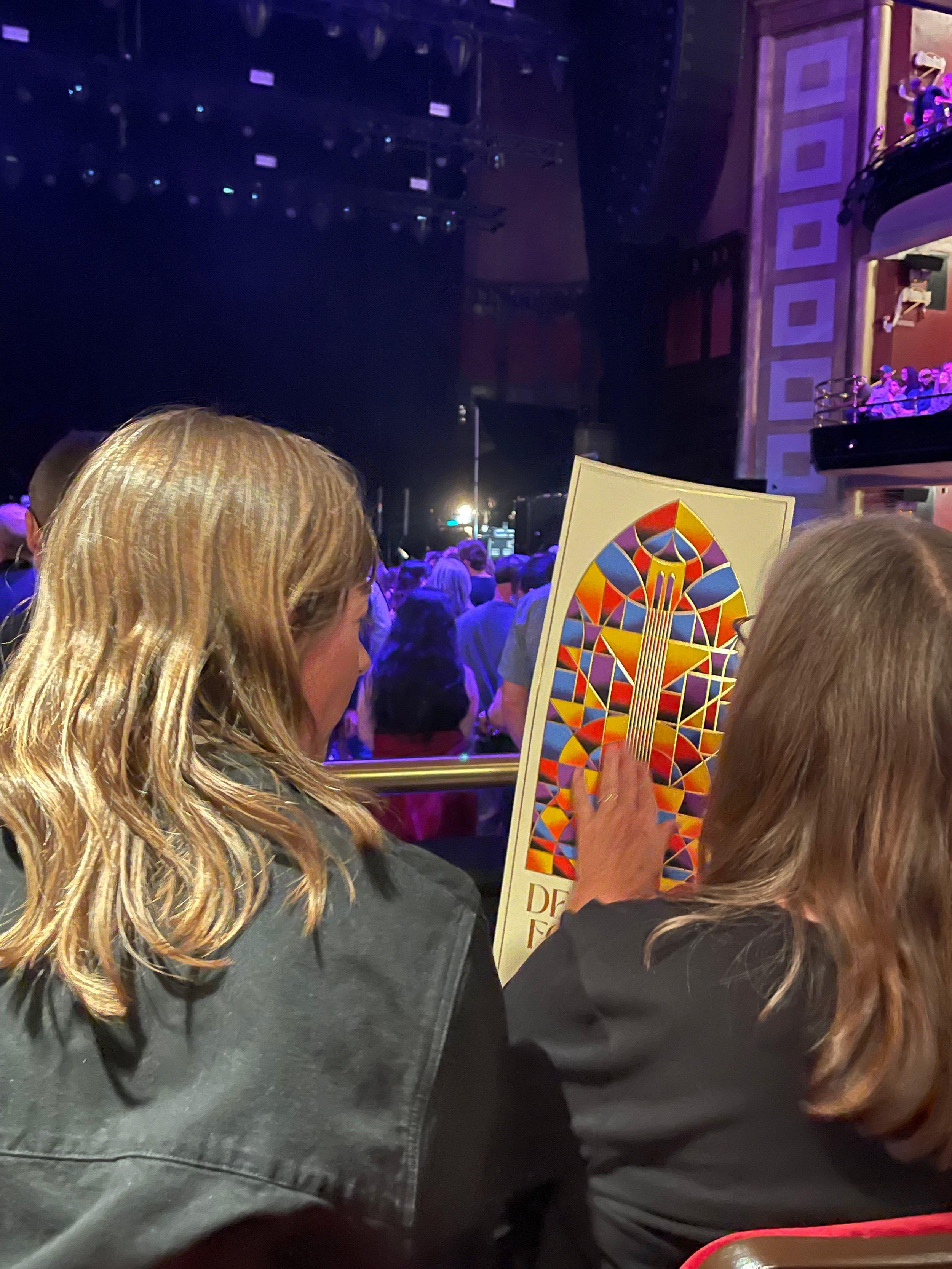
I recently had the privilege of collaborating with Death Cab for Cutie on their Toronto gig poster, and it was an absolute pleasure. What made this project even more remarkable was the distinct vision I had for its production. Every now and then, I enjoy working in a style that incorporates fragmented shapes, dissected and separated by delicate strokes or key-lines. The end result often evokes a mosaic-like feel, which strangely takes me back to my youth in Tucson, where I was exposed to vibrant Hispanic mosaic art.
With this particular poster, I wanted the key-line to stand out more than simply being printed directly on the paper. That's why I suggested we work with Flash Reproductions in Toronto, as they are known for providing innovative printing solutions that go beyond the realm of traditional methods. Thankfully, the owner at Flash Reproductions recommended a transparent laminate for the poster, which would allow them to apply a raised gold metallic ink to the key-line. When the band's management saw a physical sample of this technique, they were instantly captivated and enthusiastically gave the green light to proceed.
Below, you'll find a few images captured during the press approval process and once the posters were fully completed. While my personal attachment to the design is obvious, the production value elevated it to a level of distinction that surpassed my wildest expectations.